Wednesday, August 28, 2013

Photoshop: Drop Shadowed fonts

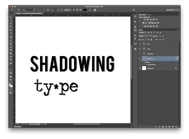
Today I saw a project someone did with a drop shadowed font. I loved it and wondered if I had any of this style of fonts in my stash. THEN I remembered that I can make my own whenever I want. And it is a very basic skill.

There are two ways to go about this. The first step is, naturally, to type the word you want in the font you want. It seems to me that a thicker font is better for this.


Then, you need to do one of two things.

1- make a copy of the text layer. My favorite way to do this is with CMD/CTRL J and that copies your layer easily. Here I moved the copy of the layer so you can see both layers.

 Next
change the opacity of the bottom layer to make a shadow you can place where you want easily with the move tool. Here I used 50% opacity. Of course, I would then place the shadow where I want it. It was just easier to have the shadow layer very separate so I could see what I was doing. Just use the move tool to get it where you want it.


OR


2-use the layer effects and make a drop shadow. I recommend a size of 0 on the shadow to give the solid look we are going for. The spread doesn't make a difference, so leave that alone. The distance and angle are what determine the placement of the shadow.


You can also drag the shadow around with the mouse, and be done with it.  But, if you are like me and want to be fussy about just where to place the shadow, here is what you need to do. If you are following method 2, after making the drop shadow, right click the layer in the layers palette and choose create layer.
 
Then you will get a shadow layer on it's own; and it is now as if you did method one, with the font on one layer and the shadow on it's own layer.  

3-Now, with the font and shadow separate, it is easy to use the arrow keys to nudge the shadow just where you want it, or click and drag it around.


Or use Free Transform (cmd/ctrl T) to play around with the shadow. Like so.


 NOTE: The best (meaning easiest to go back and change what you typed) way to do the shadowing would be method two (layer effects drop shadow), without separating the shadow. Then it is easy to go in and change the text without having to change the text layer and the shadow layer. But sometimes you just need the layers separate so you can play more with them, as in the example above. Just do what works for you and be aware of the other options that are out there. Just in case. :)


Monday, August 26, 2013

Photoshop: Blend Modes

Blend modes are one of the sweet hidden tools in photoshop. I love to use them, but I often have to just go down the list to find the look I want. I have my favorites but sometimes it can be a little hit or miss. I saw a cheat sheet over on The Daily Digi and noticed it was missing a couple of the blend modes, so I decided to make my own graphic of all of the blend modes on Photoshop CS6.

And just because I like to see different takes on the same concept, I made it in solid tan, blue, and a fun paisley by Daniellee from the Daily Digi's bonus files The Good Life. Isn't it fun to see how the paisley pattern interacts with the photo?  Now, obviously, some of these looks aren't great, but remember the opacity slider. And there's always combining blend modes. But that's for another day. :)

The super basic explanation of how to use the blend modes:
Put a paper or solid color on a layer under your photo layer. On the photo, use the drop down menu for the blend modes (at the top of the layers palette) and choose the blend mode you want. Change the opacity slider (right next to the blend modes drop down menu) to get the look you want.


Monday, August 19, 2013

Digi Layout and a Tip: Masks to frame

I don't know when it happened, but I seem to have made the transition from paper to digi pages. Digi really is a lot of fun. I still have so many paper supplies and printed photos, but how fun to be able to put together a page the day after I take a picture. And in a style I could never achieve in paper supplies alone. I love this swirly frame and mask around the edge of the page. What a genius idea to have a mask with a frame to provide an easy way to change the outer edge perfectly. This is from a collaborative kit I got from the Lily Pad called Hoppy Birthday.  In fact, all of the products on this page come from that collaboration, except the two journaling cards which are from the Lily Pad's Ultimate vacation products this summer. These are from Splendid Fiins, one of my new favorite digi designers. I love her products!


I staged the photo on top after seeing a similar photo recently (but I can't for the life of me remember where...)  The comic book styling came after using a Pixma facebook app. It was a lot of fun. :)  And the layout is courtesy of this month's Digi Files Get it Scrapped class videos. I learned a lot about layering embellishments and general layout tips.

Monday, August 12, 2013

Digi Layout and a tip: Non-destructive editing

So, this layout uses another Rainy Dayz template and one of the current Digi Files kits: Fayette Designs  kit Lost Without Lists.  Tip: See that paperclip? It started out as a full paperclip and I added a layer mask to the image so I could mask out the part that is going "under" the other papers. I learned my lesson in the past to not just erase the part I didn't want. The more you can do non-destructive editing of images, the more flexibility you have to change your mind.


Friday, August 9, 2013

Photoshop Tutorial: Make a outline font from a solid one...and fill it!


For our second installment of working with fonts, I will show you how to make an outline font and how to fill it. It is easier than filling an already empty font, as you will see. First, I found this great font. (Paper Cut Out from dafont.com) It is perfect because it is solid, thick, and so fun! Note: I did change the spacing between the letters, the tracking, with the character panel. Just to give me more options later on with the outlines.


Then I made a copy of the layer with cmd/ctrl+J and added a small stroke to the outside of the top layer.

 If you just want to make an outline font, go in and change the color of the text in this step to white and you can have this:
 If you want to clip on fun paper here,  there are a few more steps. After turning the outlined layer to white, clip patterned paper to the first (non-outlined) text layer. Then, on the outlined text layer, change the blend mode to multiply and the paper will show through!

You'll notice in this font tutorial, no rasterizing was needed. That means, if you want to change the text you can! Just be sure to change it on both text layers. ;)


Bonus: if you want to turn this one into a digi sticker, this will require just one more simple step. On the bottom text layer add a wide white stroke. Super simple!


Photoshop tutorial: filling an outline font

When I first started learning Photoshop, I tried in vain to figure out how to fill the middle of an empty font, like this one. (Agent Orange font from www.1001freefonts.com)


Determined to figure it out, I sat down today and in a few minutes I got it done. Here is how I did it! All my work is done in Photoshop CS6 on a Mac, fwiw. If all you want to do is to fill with a solid color, you can quickly do so with the paint bucket tool. Click on the color picker, choose your color, and click with the paint bucket (shortcut=G) in the white areas of the letters to fill:


But, this doesn't help if I want to use patterned papers to fill the letters. That takes a few more steps. First, you need to rasterize the font layer. I prefer to always make a copy of the layer first (cmd or ctrl J) just in case I need to go back to the beginning and start over without completely starting over...once you rasterize a text layer, you can no longer go back and edit the type. To rasterize, I click on the layer in the layers palette and choose rasterize. Now, if you turn off the eyeballs next to all the layers but the new one, you will see that the black outlines are on a transparent layer, like so:


You will need a new blank transparent layer at the end of this next step. Just click the new layer icon at the bottom of the layers panel so it is ready. Now, cmd+click (or ctrl+click) on the thumbnail of the rasterized text layer and it will put marching ants around the letters. If we filled now, it would just change the color of the currently black parts of the letter. We could have done that when typing the text to begin with, using the font panel color picker. To now select the inner parts of the letters, cmd+shift+I (ctrl+shift+I) to inverse the selection. You'll know it's inversed if the marching ants are around the whole screen. Now click on that blank layer we made and click inside the letters with the paint bucket. It will look like this:


Don't despair--it is easy to get rid of all that extra color. After hitting cmd+D (ctrl+D) to get rid of the marching ants, find the magic wand tool.  Be sure the contiguous box is checked and click anywhere outside of the letters, then hit delete. Voila!


Now, turn off the black outline layer and you will see your clipping mask:


And when you bring in some cute patterned paper and option+click (alt+click) between the layers in the layer palette and clip the paper to the mask, you can get something like this:


(Bella Gypsy Road Trip Multicolored Chevrons paper)

It is completely reusable, as long as you always want the same word. Or, if you want to make your own alpha set you could fill a page with the alphabet and follow the same steps. And then just save as a PSD or TIFF to be able to change the background at your will.


BONUS: Make it a digi sticker!

On the outline layer, add a stroke in layer effects. Make it white and a width of about 30 px and you can have this (with a blue background layer to see the stroke outline better):


Wednesday, August 7, 2013

Digi Layout and a tip: making a scalloped edge

This layout uses a kit from August's Digi Files: Meredith Cardall's A Bushel and a Peck. I was pretty proud of myself making the scalloped paper.  Here's how: On a new layer, I used the rectangular marquis tool to make the large rectangle and filled it with a color. Then I dragged down a guide line from the ruler to help me get a straight line of circles using a hard edged circle brush. Last, I just clipped the blue paper to the new scalloped paper. Voila!


Getting caught up....digi layouts (with tips, of course :)

I decided instead of a new post for each of my layouts I've been working on over the last month, I should just lump the rest into one post. Easy peasy.

All of the products in this layout are from last month's Digi Files from the Daily Digi. It is an amazing deal every month with a huge amount great products. The two kits I used here are 95 Days of Summer Fun from Sarah Jones and Sara Gleason's Coconut Tree. Tip: in my journaling you will quickly notice some words that stand out. Using a bright color and a larger font size it is easy to see what the important words are. And it gives some visual interest to these large blocks of text.


I was going for the look of a magazine ad: large photo and white space. I even added the photo credit as in a magazine. And don't you love that font for the title? The tip here is to find fonts that match the mood and theme of the page. There are so many free fonts out there waiting for you to find them! (The title font is called US Declaration.)


This page was one of my first. I worked hard to get a paint look behind the journaling. It didn't turn out how I wanted, but it's kinda fun to keep old pages to see how I have progressed. I worked a lot on this page to get the shadows right. When you have layered elements, like in the top corner of the photo, sometimes the shadows don't look right as elements have different layers to shadow to. The tip? Right click on the element layer in the layer palette and choose create layer. Then the shadow will jump down to it's own layer and you can manipulate it to suit the situation.


This uses a template from a Jessica Sprague challenge, which just happened to work with one of my favorite photos last summer of Grandpa's canoe. Tip: Use an inner glow around your photo to give it a bit of a chalked edge.  You can also paint on a blank layer to get more of an uneven edge to the "chalking", but for a quick fix, inner glow is the way to go.


Digi Layout and a tip: visual triangle with a twist

Little Green Frog Designs provided this template over on Scrap Orchard. The tip here is a simple one, with a twist. I have a visual triangle with the flowers on my Mom, the flowers under the Mom title, and the tab/button cluster at the bottom. The twist? I used part of a photo instead of just embellishments as part of the visual triangle!


Digi layout and a tip: cut out the title

This is for LGFD May Blog challenge using her free template and Erin Kay Studio's Today Tomorrow Always kit.  My favorite techniques on this page are using the digital brushes as frames and the tip? Using an inner shadow on the title so it looks cut out of the page. So easy and so fun!


Tuesday, August 6, 2013

Digi layout and a tip: tone down the brightness

I got some great new products I wanted to give a try. The template is from Rainy Dayz and everything else is from Snips and Snails. The how to tip for this page: The To Do List, background paper and floral paper were too bright for my page. The elements came from different kits, but were a close match for what I needed. So, I clipped a blank white layer to each of these elements and used a Soft Light blending layer. Voila! Toned down just enough for my needs. You can also do the same with a solid white layer on a normal blending mode and just change the opacity. After all, as with most techniques, Photoshop has so many ways to get to the same end. It just depends on you and your project!